.png)
Workflow
.png)
Overview
The Design to Code workspace in Codespell.ai includes a powerful Figma plugin that enables developers to convert visual UI components into clean, production-ready frontend code.
Built to support both web and mobile applications, the plugin ensures code consistency, reduces rework, and accelerates handoff between design and engineering teams.
This feature is available as part of the Pro Plan and is intended for teams working on front-end applications using React, Angular, or React Native.
Workflow
Step
1
Launch the Plugin in Figma
.png)
Open your design file in Figma
To launch the Codespell.ai Figma plugin:
.png)
Right-click anywhere within the Figma design file.
Navigate to Plugins → Development → Codespell.ai.
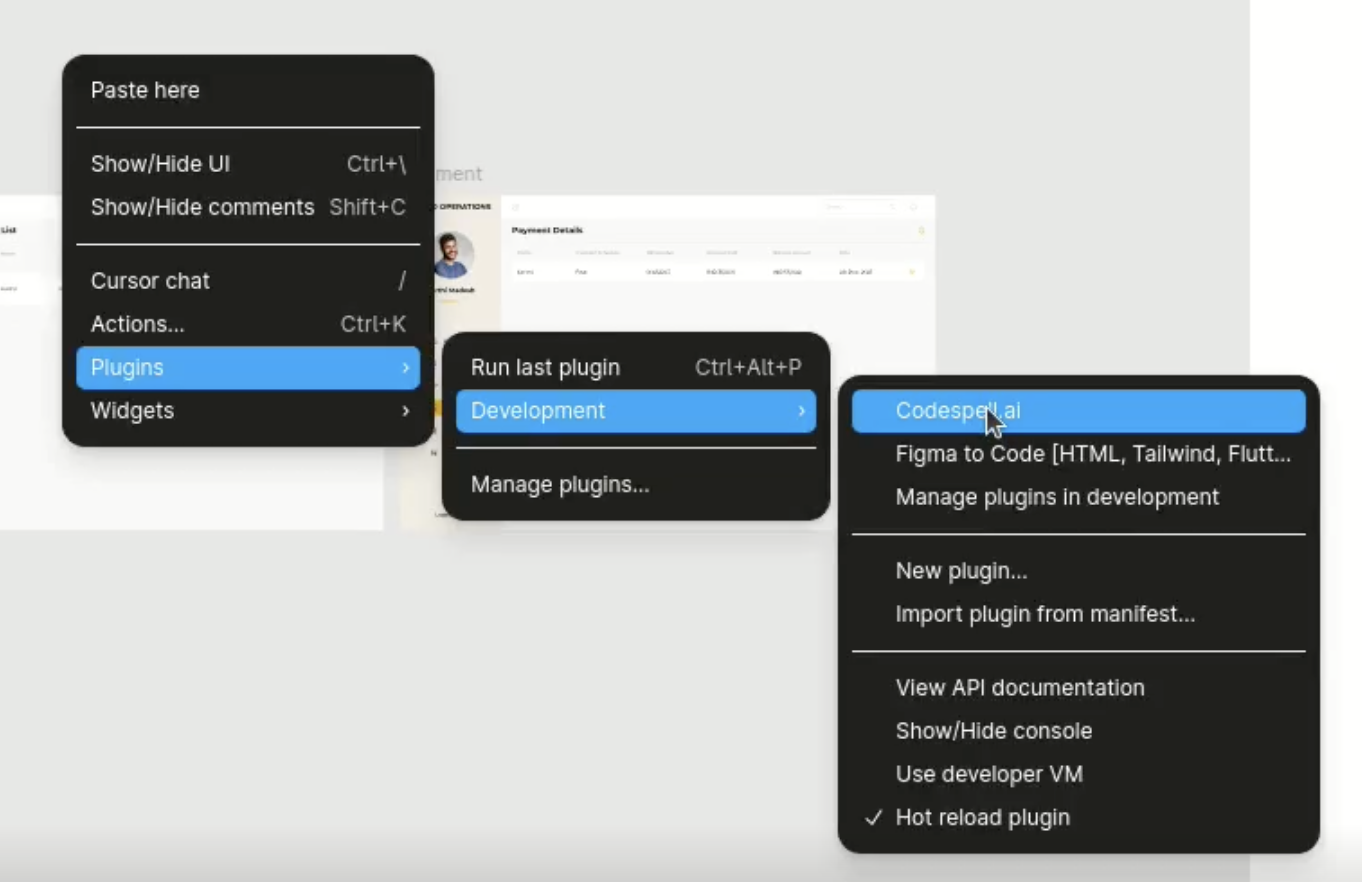
Fig 1: Launching the Codespell plugin via the Figma context menu under Plugins → Development.
Step
2
Sign in with Your Codespell Account
Click “Sign In” to login screen using your Codespell.ai account.

Fig 2: Prompt shown in Figma plugin to initiate the login process.
You will be redirected to the login screen in your default browser.

Fig 3: Redirected login screen in the browser for Codespell authentication.
Enter your Codespell credentials to authenticate.

Fig 4: Authentication screen for successful login.
Upon successful login, you can return to the Figma application.

Fig 5: Success message within the Figma plugin confirming that the user has been logged in.
Step
3
Select Team and Project
Once signed in, the user should choose the relevant team and project to which the current UI design will be mapped.
If a project has already been created using the Codespell.ai IDE plugin, it will appear in the list - provided it is tagged under either Web Application or Mobile Application.

Fig 6: Dropdown showing available projects in the Codespell workspace.
Creating a New Project:
If the desired project does not exist, you can create one directly within the plugin:
Click on “Create New Project” in the plugin interface.
Ensure you’ve selected the appropriate Team at the top.

Fig: 7: Create New Project’ option within the plugin
Enter a Project Name and select the Application Type and click proceed:
Web Application
Mobile Application

Fig 8: Create New Project’ screen with a field to enter the project name before proceeding to application type and tech stack selection.
Choose the Technology Stack:

Angular
React
React Native

Fig 9: Framework and technology stack selection screen
Select the Language and Additional Tools:
Preferred language (JavaScript or TypeScript)
Optional libraries and tools (unit testing frameworks, styling methods, etc.)

Fig 10: Programming language selection interface offering JavaScript and TypeScript choices for code output.
Click “Proceed” to complete the project creation.
Once created, the new project will appear in the Project dropdown list. Select it to continue with component selection and code generation.
Step
4
Selecting Screens and Components
After completing the project selection:
The plugin will display all available frames, organized as:
Screens

Fig 11: Screens tab: shows complete page layouts available for code generation.
Components

Fig 12: Components tab: lists modular UI elements like buttons, forms, and cards for targeted export.
The user can select one or more of the Screens & Components for code generation.
Once selected, proceed to the Summary page to review your selections before generating code.
Click “Proceed” to complete the project creation.
Once created, the new project will appear in the Project dropdown list. Select it to continue with component selection and code generation.
Step
5
Review Summary
A Summary Page is displayed before generation.

Fig 13: Summary screen showing selected items, target framework, language, and estimated credit usage prior to code generation.
This includes:
Number of components selected
Target framework and language
Estimated credit usage (if applicable)
Step
6
Generate Code
Click “Generate Code” to process the selected components.

Fig 14: Final step before download, with a 'Download Code' button to trigger frontend code generation.
Codespell will generate:
JSX/TSX or HTML/TS files
Associated styling files (CSS, SCSS, or styled components)
Any layout wrappers or theme references
Step
7
Download Output
Once the code generation is complete, click “Download Code” to receive a ZIP file containing your project scaffold.
Fig 15: Confirmation with summary of file generation containing project scaffold.
The downloaded package includes:

Project Configuration Files
Essential files for project setup, dependency management, and tooling configuration. These ensure the project is ready to run locally or integrate into a CI/CD pipeline.
Source Directory

Contains all application code, organized into:
Components – Reusable UI elements such as cards, forms, and navbars.
Screens – Page-level views derived from Figma frames, categorized by features like Dashboard, Payment, or Students.
Styling Files
Modular SCSS or CSS files associated with each screen and component, promoting consistent theming and maintainability.
Entry and Bootstrap Files
Includes the main application entry point, global styles, and rendering logic to kick-start the app in a browser or mobile environment.
Fig 16: Folder structure of the generated ZIP file showing components, screens, styles, and configuration files.
Fig 17: Example of generated React component with associated SCSS styling.